Thursday, 10 March 2022

Magazine Front Covers


The front cover keeps to the rule of three by only using red, blue and white. These colours connotes the preferred audience is males and the fact that Leonardo DiCaprio is the model targets it at the middle aged.

The negotiated audience are those a bit younger

The background is plain white to represent neutrality and the red and blue font stands out from it.

The foreground shows Leonardo DiCaprio stood up straight and gives a direct mode of address. He is dressed formally in a suit and represents what a man wants to be.

The puff of "great buys under $200" attracts people who want to look like Leonardo DiCaprio but with a lot less money.

"Hollywood's biggest star" 

The less fancy San Serif font connotes that Leonardo DiCaprio is a modern man and has an achievable look.

Tuesday, 8 March 2022

NEA Briefs 2023

 Brief 1: Television and Online - produce a three minute opening sequence of a new lifestyle programme for Channel 5 and two pages for the working website for the programme. 

Lifestyle is the way someone lives, what we repeatedly do everyday, everyone lives a different lifestyle and there are many factors. This could include: how you eat, how active you are, how much you socialise, what kind of place you live at, what your beliefs are.  Most people choose their lifestyle to what they need, want and feel. 

The brief requires the website to promote a new lifestyle television programme which I am creating the first 3 minutes of. However, when researching the lack of currently existing lifestyle TV programmes which would target the 16-25 year old audience makes it difficult to come up with ideas and is uninspiring to create one.


Brief 2: Radio and Online - produce a three minute opening sequence of a new celebrity interview programme for local commercial and two pages for the working website for the programme.

This task requires at least 3 actors to create the interview, two are needed to perform presenters and the other is to perform a celebrity. The actors need to be confident and talk like they are their roles but the lack of confident actors who would be able to make it look real makes me believe it will not turn out well.


Brief 4:Music video and online - produce a three minute music video for an anthem by a fictional singer which includes two actors and create two pages for a working website.

This task is daunting and seems impossible because I do not know anyone who can sing confidently on video in public. Also the music video would require over 200 shots in at least 2 locations and any missed shots would require me to go back to the locations and get the shots

Thursday, 3 March 2022

Stranger Things Fandom, Merchandise and Marketing


Stranger Things 2 Super Bowl 2017 Add

The beginning of the season 2 trailer is a homage to the 80's with a classic 80's TV advert. This creates nostalgia for the older audience and authenticity for the younger audience which brings in a wider audience.


The trailer transitions from the advert to Stranger Things with fuzz like from an old TV to create more nostalgia for the audience. This can create a suspension of disbelief in the viewer and gets them hyped for the new series.


The advert contains the well known Stranger things neon red font as it is recognisable branding which creates synergy. Netflix wants to create momentum with the series by using Neale's theory of repetition and difference with the number "2" which inspires fandom. 


The end of the trailer celebrates the success that Stranger Things season 1 had with the "Only On Netflix" flipping upside down to show how invested they are and it brands the LFTVD as their own. This also creates synergy as it is recognisable and associated with Stranger Things. Netflix relies on the show to gain popularity, more revenue and make it a headline streaming service. 

Stranger Things Season 1 Trailer 1


The trailer opens with a shot of an old radio, dating the time that the show is set. Then the trailer cuts to a shot of the typical 80's family of the Wheeler's with a clean house and relaxed family. This brings nostalgia of the 80's to audiences who were alive then which attracts a wider audience and increases 
                                                                                    the shows popularity.


We are also introduced to the character of Joyce who is the opposite of the Wheeler family, panicking and dressed scruffy, we do not see a partner of Joyce so we assume that he's gone and she can barely provide for her family. 


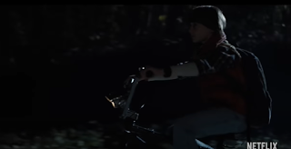
We are shows shots of a dark, misty forest and Will, a young boy, running from an unknown predator. These are horror conventions which attracts fans of the horror genre and increases the popularity of the show. 


In the middle of the trailer it cuts to this shot with the S and T in neon red font in the background with "Netflix presents" in the middle. This shows they want you to know it is their show so it attracts more people to Netflix and earns them more money.


We are introduced to Eleven who immediately contrasts the conventions of a girl, with short hair.
She barely speaks during the trailer and is never given a name, just called "the girl" with a shot of 011 printed on her wrist. 


The final shot shows the "Stranger Things" writing in red neon, this is repeated across all Stranger Things trailers and is now connected with the show.

Wednesday, 23 February 2022

Stranger Things Posters


Bike without an owner - an indexical sign that someone is missing 

In a dark forest - scary, unknown, conventional horror setting

Mysterious, dim lit building in background 

Bike - large, at the front with lights focused on it make it seems important

The children have found the bike, will they look for the owner?


 Laboratory and "Restricted Area" Sign with person in hazmat suit.                                                                                                                                                                         Nancy is holding a bat like a weapon which shows she will have to fight.                                                                                                
11 as the largest person in the centre to show she is the most important and her hand in a position where it looks like she is controlling something.                                                                   
Lights and letters on the wall.                                                      
The moon and dark woods around the edge give a horror feeling and the fact that the characters are surrounded by the darkness makes them seem trapped
Gives date it was set

Top half represents the known world, bottom half represents the 'upside down'. They are mirror images but are not aware of each other 

Mysterious laboratory is seen again

Woods - conventional horror setting

Will is seen in the upside down

"Stranger Things" in red neon font - repetition, attracts audience


Eleven, Mike and Dustin hugging - friendship

Dark, misty woods - repetition, important to the story


Will is missing from the poster

Setting is nothing we have ever seen

Pumpkins at the bottom - possibly important

Shows new characters and monster 

Tuesday, 14 December 2021

David Guetta

 David Guetta is a French DJ, record producer and songwriter. In the DJ Mag Top 100 DJ's poll, David Guetta was voted the number 1 DJ in 2011, 2020 and 2021. He has sold over 50 million records and his music has been streamed over 10 billion times around the world. David Guetta released his most successful song 'Shot Me Down' in 2014

 One of  his most popular songs, Titanium, was released in 2011 and has sold over 1 million copies. The song was written by David Guetta, Sia Furler Giorgio Tuinfort and Afrojack. 

The music video for Titanium was filmed in a high school in Quebec, Canada. To increase the popularity of the music video, 14 seconds were released early on the 16th of December 2011 on David Guetta's YouTube channel. The video was later released on the 20th of December 2011.

The song lyrics:
You shout it out
But I can't hear a word you say
I'm talking loud, not saying much
I'm criticized, but all your bullets ricochet
Shoot me down, but I get up
I'm bulletproof, nothing to lose
Fire away, fire away
Ricochet, you take your aim
Fire away, fire away
You shoot me down, but I won't fall
I am titanium
You shoot me down, but I won't fall
I am titanium
Cut me down
But it's you who'll have further to fall
Ghost town and haunted love
Raise your voice
Sticks and stones may break my bones
Talking loud, not saying much
I'm bulletproof, nothing to lose
Fire away, fire away
Ricochet, you take your aim
Fire away, fire away
You shoot me down, but I won't fall
I am titanium
You shoot me down, but I won't fall
I am titanium
I am titanium
I am titanium
Stone-hard, machine gun
Firing at the ones who run
Stone-hard as bulletproof glass
You shoot me down, but I won't fall
I am titanium
You shoot me down, but I won't fall
I am titanium
You shoot me down, but I won't fall
I am titanium
You shoot me down, but I won't fall
I am titanium
I am titanium

Tuesday, 7 December 2021

Construction evaluation

To create this magazine front cover I needed a picture of Dillon and to get one, I needed to use a camera and direct Dillon into the same pose as the one on the front cover of the magazine I am copying. What went well is that I managed to get Dillon into the centre and into the same pose as the magazine. I could have taken more photos though to allow me to have a wider variety to choose from when copying the magazine. Also I could have chosen a better magazine to copy because my first choice was not professional and went against a lot of magazine conventions. 

The photos I took were uploaded onto my computer but I needed to select the one which I think best copied the magazine and looks the best. I learnt to look more closely at the pictures and see what was similar and different to the original cover.

When editing the picture of Dillon, I learnt to used Adobe Elements 11 to improve the quality of the photo and to crop Dillon so he would cover more of the page.

After that, I learnt to used InDesign to add the masthead and other text to the magazine front cover. I then learnt to changed the colour of the text and add colours behind it to make them stand out. When making the front cover, I learnt how simple it is to add and change the colours and positions of the text. When copying the cover, I learnt how they were set out to have the model in the middle as the main focus and the test surrounding them. I can also see how they choose contrasting colours to allow for some parts like the masthead to stand out and attract people.

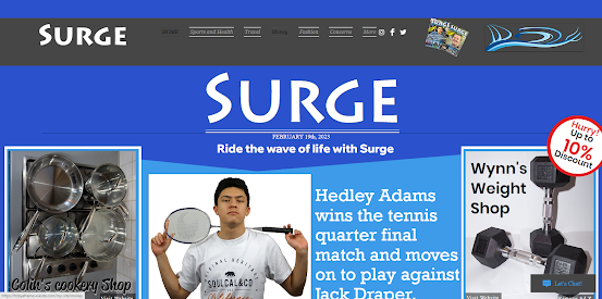
Surge website and link page

HOME | My Site (tobyaframe.wixsite.com) Link page