Choosing photographs- this is quite a challenge as there are many I like- I will use flickr and get some peer feedback and TA responses.


 I really like this one! I think it connects with the TA
Choosing photographs- this is quite a challenge as there are many I like- I will use flickr and get some peer feedback and TA responses.
I really like this one! I think it connects with the TA


"Subscribe to get the best Verge-approved tech deals of the week" - Call to action, attract customers with deals and increases profit for the company with user spending more money.
The section with subheading, "Featured Videos", users can play the videos on the website which gives the user a better look at the products they are showing.

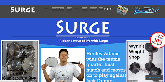
Eloise: Hello Surge readers and welcome to an exclusive interview with Hedley Adams. So, Hedley you are a sports business entrepreneur, how are you so motivated to get into it?
Hedley: It's just about making a lot of stuff and a lot of people are very happy with the wok that i am doing so, it's just the positive feedback from the customers
Eloise: So, how do you consider the way your audience thinks when it comes to your business?
Hedley: I just think about what people want and most importantly what people need so that kind of comes into consideration
Eloise: And where do you see yourself in the future.
Hedley: Still the same just making the same stuff, always trying to improve the products that im making and still making people happy with what I'm doing
Eloise: Now, people think that you're going to be the next Elon Musk, what do you think about that?
Hedley: That would be good, but we'll have to wait and see
Eloise: And that's all for today readers, if you want more, you'll have to come back later this week.


Date of release
I like the idea of 3 columns with the main stories and larger pictures at the top.
3 columns:
left column - subheadings and content.
Centre column - top half includes pictures an the bottom half includes content.
Right column - pictures.
I don't like how the columns and subheadings are separated with thin black lines. It makes it easy to distinguish what is under each subheading but it looks ugly.
I plan to use a "on the cover" with a small picture of the front cover.
I like that "contents" is in a different colour and a different font from the subheadings.

I like the use of Yellow front for sub headings and numbers because it contrasts with the white and blue.

I like the use of a medium longshot to show his body and hands on fire to represent power. The background is black and enhances the sweat coming off him.
I like the use of the models body language. It is large, dramatic and expressive, showing their size and strength.

I like the longshot of the bodybuilder to show his strength but I don't like how it is a silhouette as it makes it impossible to see his facial expression which dehumanises him. Maybe if the reader could see him, they would think that that physic would be possible.
I like the colour of the yellow font as it is easy to read and blends well with the colour of the fire and burger.
I plan to include information on sport supplements. I would add something to this picture to make it more exciting and eye catching.

The yellow of the burger blends well with the colour of the fire and font. I would add a caption to this picture as it may seem confusing. This isn't telling the reader if they are for or against eating burgers which would sway a persons decision to buy the magazine.


